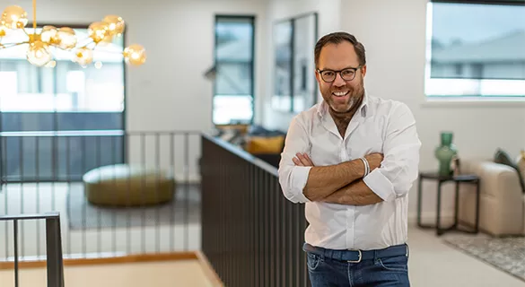
Discover Your Inner Designer with Expert Tips from James Treble
- Published: Thu 25 January 2024
- Last modified: Mon 22 September 2025
- 5 minutes

Building your brand-new home is more than just a milestone, it’s a chance to explore your personal style and elevate every space. And the best part? You don’t need a costly course to get started.
Eden Brae Homes has teamed up with leading Australian Interior Designer James Treble to share his top tips for mastering interior design. From layout to lighting, colour palettes to textures, James offers practical advice to help you create a home that feels uniquely yours.
Tip 1: Establish your theme
To set yourself up for success, James advises that it's essential to establish a theme for your home before getting started.
"In all of my projects, including the display homes I create for Eden Brae Homes, I establish a theme to provide direction. Doing this ensures I create a consistent story from the façade right through the whole home," James says.
Your theme gives your house its personality. To decide your theme, James recommends looking at your building's design, starting with the façade.
"The architecture of your home is really relevant to the theme – a classic façade will evoke quite a different interior design to one that’s coastal or modern," James says. "The great thing about Eden Brae Homes is they have a massive range of façade options, named to help evoke a distinctive style and feeling to make your choice easier."
James also recommends considering your home's location when you select your façade because sometimes certain homes look great in one area, one street or even on one type of block more than another.
Once you’ve made your decision, you can move inside your house and interpret the theme with the finishes you bring together to personalise the space.
Tip 2: Create a mood board
Mood boards are an essential interior design tool to collect images defining and refining your theme. The good news is, they're more accessible than ever.
As James says, "We're spoilt by so many resources online to help you quickly and easily build mood boards. In the old days, we'd sneakily tear pictures out of magazines in the dentist's waiting room to stick on a physical board. Now we can create digital boards, searching from the sofa, surfing the world for inspiration!"
You don't have to stick with pictures of interiors only either. James suggests incorporating anything that inspires you, including fabrics, nature and treasured artworks. Even adding small things like shower screens, blinds, tables, and other essentials can make a big difference to your mood board.
James guarantees a mood board will keep you on track. Sharing them with the people you'll be living with ensures everyone will be happy with the design, too.
James believes mood boards are very telling, revealing what you do – and don't – want for your new home. Everything is answered for you by the images you've chosen.
As James says, "You may have in mind you love timber floors. The images you select for your mood board will show whether you favour light or dark timber. You may think you want bold joinery, but your image choices may actually suggest you gravitate towards classic profiles."
Mood boards are also guaranteed to save time in your building process.
"As the saying goes, a picture is worth a thousand words, and this is especially true when you're designing a new space," James says. "Interior design has its own language, but pictures are a common language that everyone can speak to simplify the process. When I work with a client who has created a mood board, they almost don't need to say anything. I instantly get their theme and can focus on bringing together options to suit."
James says everyone you work with in the building process, from your kitchen designer to the colour team, will appreciate you bringing your mood board to consultations, helping them quickly identify options that suit your theme and budget.
A final tip from James is not to be afraid to edit your mood board as you move through the process and discover new ideas or extensions of your themes.
Tip 3: Take inspiration from display homes
James' final tip for being your own interior designer is to immerse yourself in the work of other interior designers for inspiration.
"I spend lots of time creating beautiful display homes for Eden Brae Homes so that people can wander through them and get inspired," James says.
James advises taking a day off work if you can and visiting display homes on a weekday when they tend to be a little less busy. He encourages spending quality time going through every home, not just the ones you think you prefer and taking photos for reference. And don't be afraid to mix and match things you like from different homes.
"Display homes present the perfect opportunity to see the very latest interior ideas and trends to inspire your design of a home you'll absolutely love," James concludes.
Interested to learn more? Visit the Eden Brae Homes website for more design tips, including videos, from James.
Featured Promotions


